
Wednesday, December 28, 2011
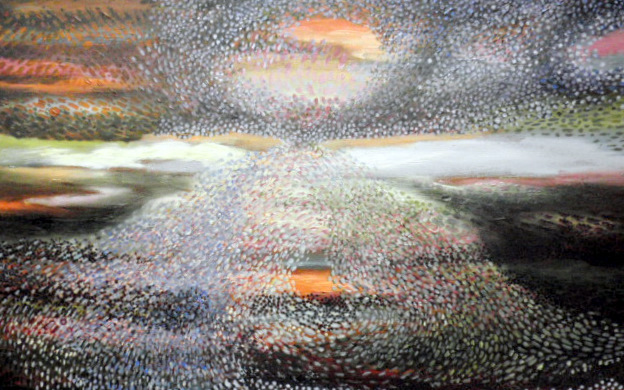
"Portal" painting, evolving
The "Portal" painting now has more color, more warmth, more contrast and drama. Many, many hours - and more to go. Truly a labor of love.
Sunday, December 4, 2011


Saturday, December 3, 2011

Monday, November 28, 2011
"Peach Abstract," beginning stage
Using variations of peach, I'm applying very thin glazes, to suggest architectural elements, in some type of space.

Tuesday, November 22, 2011

"Luminescence" painting
This is a re-worked painting. The original version seemed to have too much warmth, so I added more cool colors, both dark and light. The result is very different.
Monday, November 14, 2011

"Edifice, Fog"
The speeding cars and traffic lights are added below. More layers of glazes applied in the sky and fog, to make the colors pop out more dramatically. Comments? Interpretations?
Saturday, November 12, 2011

"Edifice in Fog"
Still a work in progress, I'm building up the fog effects, with wisps going everywhere. Eventually, the dark band at the bottom will have brilliant touches of color, to suggest the motion of traffic. Sky is tranquil and airy; earth is racing along in motion.
Sunday, November 6, 2011
"Flow of Life," abstract
This is the current work in progress in the studio. Swirls of energy, in alternating warms and cools, lights and darks, etc.
Wednesday, November 2, 2011

"Edifice" evolving
Today in the studio, I added more glazes to the original glazes. I'm going back and forth between playing with the dots, and applying richer and richer layers of glazes to the other areas. The drama of the painting is building.
Saturday, October 29, 2011

"Edifice" painting, stage 2
The "Edifice" painting is evolving: hundreds upon hundreds of dots, suggesting fog, a soft sun set, and the soaring architecture. Comments and reactions are invited, please.
Wednesday, October 26, 2011
Green abstract, almost complete
The fundamentals of the painting have now been applied. Some more refining to be done, but this photo gives the general idea of this abstract piece.

Sunday, October 23, 2011
Green abstract, stage 3
In this stage, I'm increasing the contrast in the upper area, so the bold colors show through. Suggestions are welcome. This is an exploration process.

Monday, October 17, 2011

Green abstract
The green and blue glazes have been applied. Now I'm adding touches of orange, red-orange, etc. More color abstractions to follow.

"Edifice" stage 2
The blue and pink glazes have been applied. Now I'm adding hints of a tall building and fog around it. More color and abstraction to follow.
Thursday, October 13, 2011

Stage 1, abstract
This is one of two paintings I'm doing together: one horizontal and one vertical. Here, in stage 1, thin layers of gray (dark and pale) are applied in abstract patterns. Color will then be applied on top of this gray abstract foundation (see stage 2 below).

Stage, 2, abstract
This is one of two paintings I'm doing together: one vertical and one horizontal. In stage 2, color glazes are being applied to the original abstract patterns in grays and whites. For this (vertical) painting, the colors are Cerulean blue and a mix of Cerulean and Alizarin red.
Monday, October 10, 2011


"Abstract, Sky and Earth"
This large painting, 48" H x 36"W, is based on earth tones, with colors added in dots, dashes, and swirls. The colors are there, but the viewer can see "through" them to the space beyond. 46 hours on this painting. Oil on canvas.
Monday, September 26, 2011

varnishing day
Today in the studio, I applied varnish to several paintings which have dried completely - including this triptych. The doors and windows are open, and the ventilator fan is running. All is well.
Monday, September 19, 2011

Blue abstract, 48"H x 36"W
This is a large painting, exploring blue (in various hues). The overall effort is to create a transparent effect, where the viewer can see through, into the depths beyond.
The foundation palette is umber/burnt sienna, applied in random strokes across the surface, in light and dark shades. From there, it is a process of applying small bits of colors - all tinted with umber/burnt sienna. There are many colors, but the emphasis is on blues: cobalt blue, cerulean, ultramarine, also warm and cool greens.
The foundation palette is umber/burnt sienna, applied in random strokes across the surface, in light and dark shades. From there, it is a process of applying small bits of colors - all tinted with umber/burnt sienna. There are many colors, but the emphasis is on blues: cobalt blue, cerulean, ultramarine, also warm and cool greens.
Monday, September 12, 2011

candle light painting
This is an unusual painting, done in the dark, with only the candle providing illumination. A difficult task, but it creates a special mood.
Sunday, September 4, 2011

Blue curtain, abstract
This painting has an abstract "curtain" in blue, painted over a traditional landscape of northern California. The blue curtain has vertical folds of color added, but the viewer can still see through the curtain, to the depths beyond.

Green curtain, abstract
This painting is an abstract "curtain" painted over a traditional, realistic landscape (Yellowstone national park). The green "curtain" has vertical folds in touches of bold color.
Tuesday, August 30, 2011

First pass, abstract in blue
This is phase no. 1, laying down the foundation palette of umber-burnt sienna, in differing values. Believe it or not, this painting will ultimately be primarily in blues, but first we lay the groundwork in palette and composition.
Monday, August 8, 2011


Abstract, umber-burnt sienna
The palette for this abstract is a warmer, more soothing umber: it has the red of burnt sienna mixed in. The past two abstracts were based on umber-ocher, which has a yellowish brown tone. This is a work in progress. I'll post the finished product later.
Wednesday, July 27, 2011


Abstract #2, Umber-Ochre
Here are two images of the second of two abstract paintings, based on the palette of burnt umber and yellow ochre. This painting relies more heavily on the umber-ochre under painting, so it has a more earth-tone look. The two photos show the painting in different temperatures.
Sunday, July 17, 2011

Abstract, based on Umber-Ochre
This is a work in progress. It is based on a tone of burnt umber & yellow ochre, mixed into each of the colors on the palette. The combination is giving a deep warm richness to the overall look. Plus, the colors seem to hang together, since they are all tinted with umber-ochre.
Saturday, June 18, 2011

Abstract, "Lagoon"
This is a large painting, 36" x 48." It began as an exploration of the foundation color, French Ultramarine, in varying shades. From there, it simply grew into this abstract. Some viewers see it as the Santa Rosa lagoon, hence the title. For me, it is simply an abstract composition which evolved in colors, textures, temperatures, etc.
Saturday, June 11, 2011

Abstract in Multiple Colors
This painting began with several random strokes on the canvas, each in a different color. From there I began applying dots and dashes, which radiated in various directions from the original brush strokes. The radiating patterns interacted with each other, creating an energetic flow. In stage 3, I applied very thin glazes of strokes of lower value (dark gray purple) in vertical lines and arcs. The effect gave an architectural feel to the abstract image below, so I added horizontal lines, vaguely like stairs. Perhaps this is an homage to Piranesi's engravings of imaginary architectural settings.

Abstract in Blue
This painting began with several random brush strokes, in varying shades of blue. From there, I painted dots and dashes of different hues, radiating in many directions from the original blue strokes. In stage 3, I apply a "curtain" of vertical dots and dashes across the original abstract design. The result turned out to be a landscape/abstract in multiple dimensions. Who knew what direction this painting would take?
Thursday, May 5, 2011

"Afternoon Light"
This piece was recently juried into the national exhibit of the Colored Pencil Society of America. "Afternoon Light" is 24"H x 18"W. It uses Prismacolor wax based pencils on gray Canson Miteint paper.
Monday, April 11, 2011

Sunday, April 10, 2011
"Crown of Love," stage 2
In this stage, complementary colors are applied over the original brilliant ones. The result tones down the overall palette, while creating a glow in each area. The first layer was water soluble colored pencils. Stage 2 uses wax based colored pencils. Fun!
Monday, March 28, 2011

"Crown of Love," stage 1
Here is the first stage of a colored pencil piece. It uses water soluble colored pencils, which turn brilliant when water is applied. In stage 2, the complementary colors will go on top of this brightness, creating a calmer more subdued color scheme, but with the bright under glow of these colors.
Wednesday, March 23, 2011

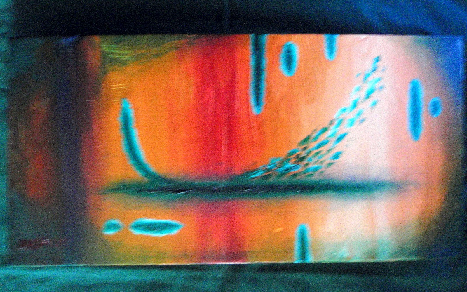
Doorway abstract
The mid-tone was a muddy brown. On top, I added thicker brush strokes of umber, purple blue, lavender, etc. It all looked muddy and confused, so I added parallel passages in viridian green and very high value viridian. The result was something vaguely like a door, leading out of this muddy mess.
"Orange & Green" abstract
The background treatment consisted of varying hues of orange. The foreground consists of abstract shapes, based around viridian green and ultramarine blue.
Wednesday, March 16, 2011

Subscribe to:
Posts (Atom)